FastTrak
Helping Publications Sell More Digital Magazines

Cashiers check, card reorder, claims and change order prototypes.


Challenge
Design a modern magazine storefront that sells more issues.
Create a reader that adapts to the publisher's brand intuitively.
Solution
Redesign the entire app from the groud up with modern UI.
Introduce two industary firsts: Timed Preview and Digital Teadcard subscription tools.
Results
58% ⬆︎
Total content downloads
62% ⬆︎
Single issue revenue
60% ⬆︎
Paid content download
4 x Higher
Conversion rate than industry
Design tools and processes

MY Role
Product Owner and Lead UX Designer
-
Evaluated competitors to understand strengths and weaknesses
-
Interviewed Starbucks customers (NYC) about their digital reading habits
-
Created:
-
Detailed project plan
-
Design System and gesture documentation
-
Wireframe and interaction documentation
-
Animated prototypes to brief developers
-
-
Owned developer build visual design progress
-
Tablet and mobile progress testing and feedback

User Flows
Flows were created that balanced the user's needs with those of the many diverse publications. Prompt fulfilment of purchases was a priority in this flow. I've worked directly with the CEO and the team of offshore developers to refine these flows for engineering teams.


Wireframes and Visual Design Specifications
Detailed wireframes and visual design specifications were developed as part of the briefing documentation delivered to the developers.

Timed Preview
With the introduction of Timed Preview, users are now able to preview a magazine for a preset amount of time before they have to purchase. The brand owners set offers that appear in this device. The pages blur when the timer runs out.

Digital Tearcard
This interstitial special offer pops up in all non-purchased issues to cross-sell subscriptions.
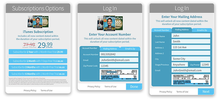
Forms
The UI had to take into account that publishers had many different ways of authenticating against their reader's database.

The Grids
Many permutations of the Golden Section ratio were used in the creation of the app. The size of the iPad informed the entire process. All elements share some reference to the size of the iPad screen. Where possible, these ratios inform the design, size and placement of elements on the page.

